Solid Icons
Design Principles
Icon grid
Icon grid is a set of rules made to keep consistency throughout the icon set.
Use the icon grid component from the Figma Asset panel.

All icons need to be in the 64x64 frame.
![]()
Original outline icon to help illustrate this point
![]()
Use a 64x64 frame/bounding box
![]()
Don’t remove the 64x64 frame/bounding box
Use the grid as much as possible to inform structure and hit the same point within the grid as the original outline icons.
![]()
Original outline icon to help illustrate this point
![]()
Do hit the same point within the grid as the original outline icons.
![]()
Don’t hit the different point on the grid.
Hold to the original grid. However, when necessary, make optical adjustments if the icons look off.
![]()
Original outline icon to help illustrate this point
![]()
Do extend content beyond the original grid if needed. Move the cloud down to create more space between the cloud and the server.
![]()
Don’t force the content to fit inside the original grid. The space between the cloud and the server here is too narrow.
Consistent style
Reference the outline icon to make sure all the icons styled the same way.
Don’t start from scratch. Use the editable outline icon as a starting point.
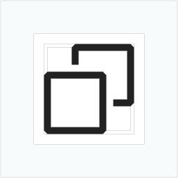
Original outline icon to help illustrate this point
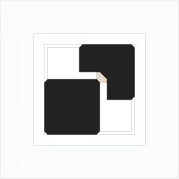
Do keep the style consistent. Create a diagonal cut with a diagonal corner.
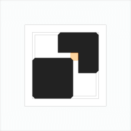
Don’t create sharp cuts for the diagonal corner.
Clarity
Never neglect clarity in favor of cohesion. An icon should deliver the correct message. If the icon won’t work in solid form, don’t create the solid variant.

Browser

Do create the solid icon that reflects the original form - browser.
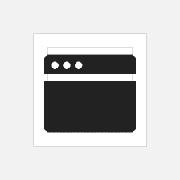
Don’t create a solid icon that doesn’t clearly communicate the original form. This solid variant looks like a credit card rather than a browser.
Icon recognition
In some cases, icons can be used as small as 16x16px. Size down the icons to ensure characteristics and shapes are recognizable in small scale. Below is an example showcasing how scale influences design decision.
![]()
Original outline icons to help illustrate this point
![]()
Do use outline inside of the solid icon if the shape edges are more recognizability in small scale.
![]()